Product Design Case Study
XIBER: An AI-Powered White Paper Writing System
Transforming 4-hour document workflows into focused 90-minute sprints with contextual, section-aware AI writing assistance.

Transforming 4-hour document workflows into focused 90-minute sprints with contextual, section-aware AI writing assistance.
XIBER's technical teams were spending 3-4 hours creating white papers that should take 1 hour, juggling between 4-5 different tools, losing context at every switch, and manually formatting everything.
Technical writers were trapped in a fragmented workflow: ChatGPT for ideation, Word for drafting, Claude for edits, PDF tools for export. Each switch meant lost context and wasted time.
An all-in-one platform with section-aware AI assistance, template management, and intelligent document structuring that eliminates tool-switching entirely.
Led end-to-end product design: user research, information architecture, wireframing, high-fidelity UI, and close collaboration with engineering.
Through 3 user interviews with documentation specialists, analysts, and writers, we uncovered a workflow nightmare costing the team 60% of their productivity.
Switching between ChatGPT, Claude, Gemini, Word, and PDF tools with 45-60 min lost per document.
Each AI tool had no memory of previous conversations so users re-explained the same project repeatedly.
Public AI tools lacked company-specific knowledge, terminology, and internal context.
Teams created templates from scratch every time with no centralized library or reusable structures.
Copy-paste broke formatting every time, leading to hours fixing headings, spacing, and styles.
PDF exports broke layouts, requiring multiple re-exports and manual fixes.
The problem wasn't just inefficiency, it was cognitive overload. Switching between 4-5 tools forced users to constantly re-establish context, disrupting creative flow and stretching a 1-hour task into 4 hours.
Hand-drawn user journey map from Week 1 research documenting the painful reality of creating white papers across 5 different tools.

User journey map of XIBER's internal team, before the platform existed.
We conducted 3 in-depth interviews with:
"I spend more time copying and pasting between tools than actually writing. By the time I get to the export stage, I've lost my train of thought three times."
Documentation SpecialistBefore jumping to high-fidelity designs, I explored multiple approaches through sketches, feature prioritization, and layout iterations.
The AI assistant was the heart of the platform. I sketched multiple interaction patterns to find the right balance between guided assistance and user flexibility.
Early sketches: chat-only vs. buttons-only vs. hybrid approach with tabs.
Predefined prompts like "Expand," "Summarize," "Rephrase" offered discoverability but felt restrictive. Power users would need custom prompts and couldn't be limited to presets only.
Combining mode tabs (Content / Structure / Format) with quick-action buttons AND free-form input gave us the best of both worlds: guided discovery for new users, flexibility for experts.
Working with the PM and dev team, we mapped features by impact vs. effort to focus on quick wins for MVP validation.

Week 1 planning session: prioritizing quick wins over complex features.
Before designing screens, I mapped out the complete navigation structure and user flows to ensure logical information hierarchy.

Platform navigation structure and editor workflow.
The 3-panel editor was our core interface, but finding the right layout took 4 iterations and multiple rounds of internal review.
How do we balance three competing needs: document navigation, content editing, and AI assistance without any feeling cramped or secondary?
Full-width editor with AI as a small floating bubble. The AI felt like an afterthought and was easily overlooked, undermining the core value proposition.

Two-panel layout with editor and AI sidebar, but no structure panel. Navigating long documents (15-30 pages) would be difficult without section-jumping.

Structure + AI stacked vertically on the left. The AI panel felt cramped in the narrow space; prompts needed more horizontal room to be scannable.

Balanced layout giving each panel breathing room. Structure for navigation, editor for focus, AI for assistance. Section-focused editing reduced cognitive load.

An all-in-one AI-powered platform that eliminates tool-switching, brings intelligence into the editing environment, and makes white paper creation 60% faster.
Centralized hub for accessing pre-built templates and work-in-progress documents.
Upload internal documents to train AI on company-specific terminology and tone.
Kick-start creation with an AI prompt or skip and start blank.
Edit one section at a time with rich text formatting to reduce cognitive load.
AI locked to the current section with three modes: Content, Structure, Format.
Hierarchical navigation with drag-drop reordering and instant section jumping.
Designed to feel familiar to users coming from Word or Google Docs while introducing powerful AI-driven enhancements.

Template Library: Central hub for all pre-built white paper templates.

My Drafts: Work-in-progress documents with timestamps and quick actions.

Conversational interface for feeding the AI company-specific content and rules.

Document processing: the AI learns from uploaded white paper structures.

Start with a prompt or skip to blank.

AI generates document structure.

Template generation entry.

Preview structure before entering editor.

Drag-drop section reordering with nested sub-sections and edge case handling.

Structure panel (left), section-focused editor (center), AI assistant with tabs (right).
I designed an admin analytics dashboard to give stakeholders visibility into platform adoption, document creation velocity, and AI usage patterns across departments.
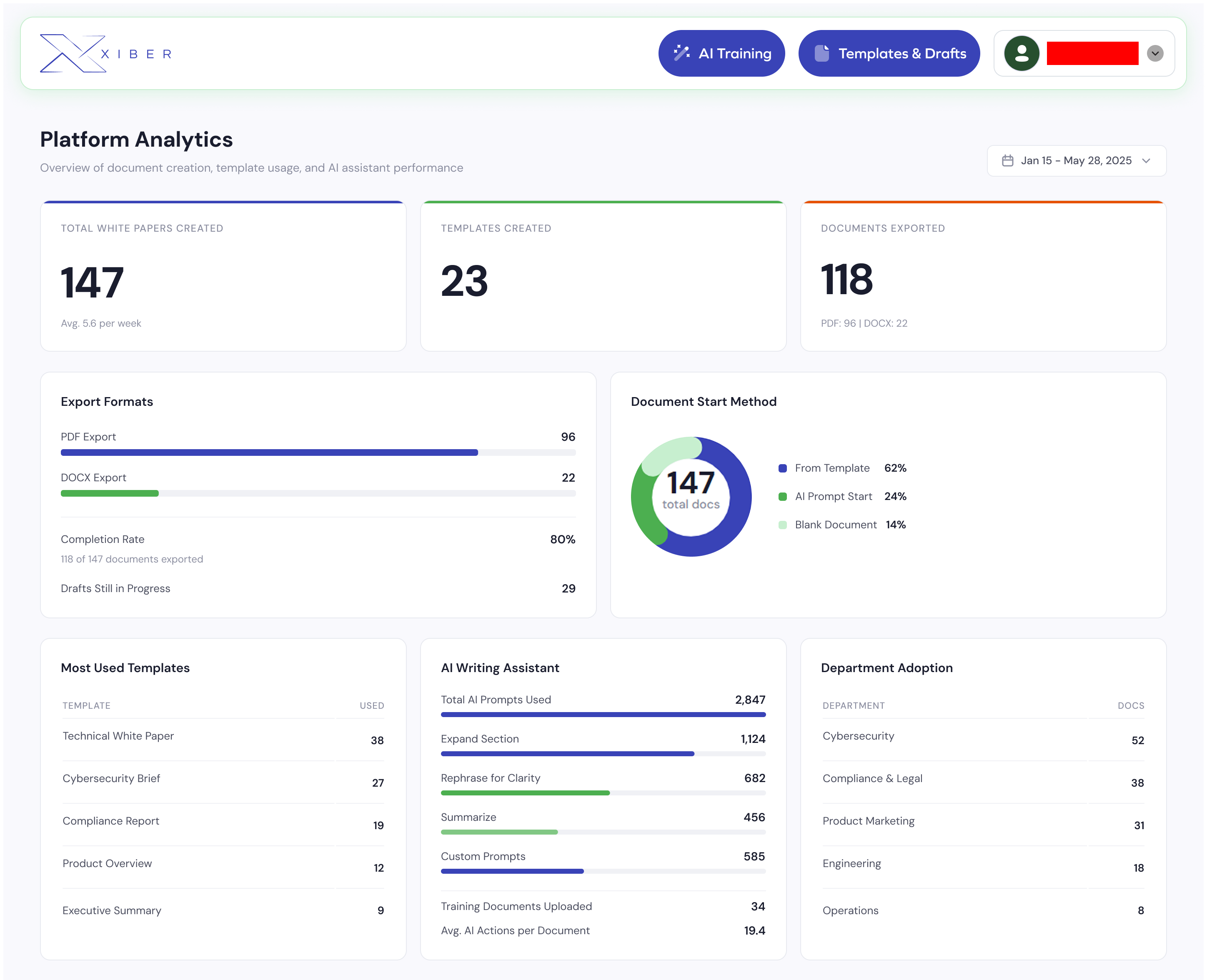
Platform Analytics Dashboard: tracking document creation, template usage, AI assistant adoption, and department-level engagement.
Created in Q1 alone, averaging 5.6 per week with an 80% completion rate across all departments.
Used across Content, Structure, and Format modes, with "Expand Section" as the top action at 1,124 uses.
Validating the template system adoption. Only 14% started from blank, proving the AI-first approach worked.
Instead of a generic chatbot that acts on the entire document, we locked AI to the current section. This reduces cognitive load and increases precision.
Content / Structure / Format tabs organize complexity without restricting creativity. Each mode shows relevant quick prompts while still allowing custom instructions.
Users have different mental models. Some want AI-generated structure; others prefer a blank canvas. We accommodated both.
Privacy concerns around uploading sensitive company data to public AI tools were a major pain point. A dedicated training interface gives users full control.
The best AI integrations feel invisible. Users don't want to "talk to AI." They want help when they need it, where they need it. Section-aware assistance was more powerful than a generic chatbot precisely because it stayed contextually relevant.
Multiple users editing simultaneously with live cursors and change tracking.
Git-like version history: revert, compare, and branch document versions.
Usage dashboards for admins: template popularity, time saved, AI adoption rates.

